Introduction to design for print
Today was a big one at the Nettl Acadamy! An introduction to the do’s and dont’s of print! I found today especially useful and interesting as it really helped give a great understanding of what to look out when designing for print. I also learnt about the variety of products and services that nettl have to offer. In today’s blog I am going to give you a summary of what we covered in this course!
RGB is short for Red, Green and Blue. The RGB colour mode uses these base colours to form just about every other colour you can imagine as red, green and blue are additive colours and is the colour mode that is used for for screens.
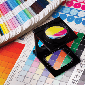
CMYK uses subtractive colours (Cyan, Magenta, Yellow and Key). Key is another term for black. The CMYK process works so that as you add colours together, light is absorbed or removed to create various colours.
Why add black?
-
Increased density in images
-
Reduces the amount of ink on paper
-
Reduces chance of misregistration
Why is it important to consider ink levels?
-
The different paper you are printing on can effect the outcome of the colour of the ink you are printing
-
Effects the drying time of the paper which would effect the jobs turn around time
-
Helps avoid bleed through on reverse side of paper
-
Also reduces risk of misregistration
What else did we cover?
We covered so much over the space of the day and some of the other things we looked into when designing for print was colour conversion and how converting images in photoshop to CMYK can effect the overall look of an image when printing. We also covered things like dot gain, which is something that can cause images to look darker and how to set preferences up in photoshop to get an overall better look with images when printing. This also led us to look into the differences between DPI and LPI.
We also learnt about spot colours, overprinting, the correct file types to use for individual jobs as well as many other tips and tricks to consider when designing. We also looked at designing with gradients and how creating a middle swatch can achieve a better colour fade when printing because it eases the transition when it prints and how going for more subtle colours can achieve a much better look!
What is a Vector?
They are created in programmes like illustrator and Coreldraw and use mathematic equations and geometric primitives (points, lines, and shapes) to create art that is clean, and can be scaled infinitely, without any loss of quality or fidelity.
What is a Bitmap?
A bitmap graphic is composed of many tiny parts, called pixels, which are often many different colours. It is possible to edit each individual pixel. These formats are different to vector graphics as when they are scaled up and down you will loose quality.
Print set up checklist
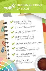
One of the best things that I took from today was going through a checklist of the most important things to remember when setting up a document for print. I found this really beneficial because we went though the main things to consider and look out for before sending something to print. This covered some of the things I have mentioned above but also a range of things also and was summed up really well. I decided to take what I had learnt from today and create a infographic checklist of these things as a way to drum it into my head and for something to check off when doing future projects to help with my piece of mind!
Nettl products, finishes and services
By the end of the day we started to look at the services that Nettl offer and some of the different finishes that can be done through getting your print done with Nettl. The main ones we looked at were: perforations – which are things that are cut out and that can be teared off. Embossing, silver and gold foil effects (a personal favourite!) and spot UV. We were given a package of different examples of these finishes with handy do’s and dont’s to consider when designing with these finishes and how we can use them to their best potential!
We were also shown some of the main products that are sold from Nettl, which are booklets, leaflets (Cross-fold, Z-fold, R-fold), flyers, postcards, greetings cards, fabric banner stands, roller banners, business cards and much more! We went though a few tutorials on setting up the templates and things to look out for and remember when designing.
Conclusion
All in all, I think it was a very productive day and if you have the opportunity to attend this course I would defiantly recommend attending as it is a really good breakdown of all things designing for print!

